Designer & Illustrator
About
I am a Graphic Designer and Illustrator driven by a dark, horror aesthetic and a passion for the unconventional. With a strong foundation in Fine Arts, I create bold, expressive illustrations and layouts that challenge traditional design norms.
I specialize in bridging the gap between classical artistic principles and modern digital workflows. My work is characterized by high-energy visuals and atmospheric storytelling that resonates deeply with alternative audiences.
Selected Work
Illustration · 2026
Problem
As an illustrator with a deep personal passion for the craft, I found myself at a crossroads — I had the drive and technical ability, but lacked a signature visual style that could set my work apart and be instantly recognizable as mine. Without a cohesive aesthetic, building a professional illustration career felt out of reach.
Solution
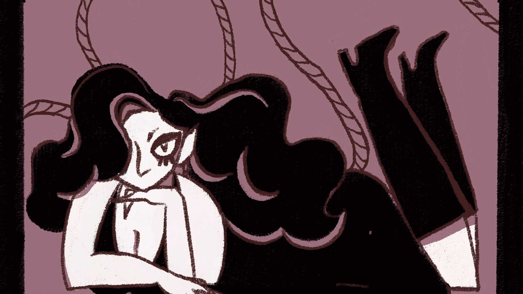
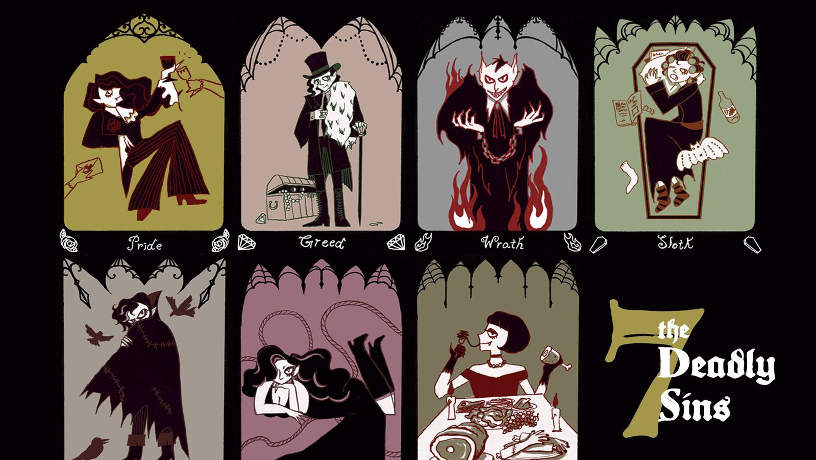
I embarked on a focused personal project — the 7 Deadly Sins series — to develop and solidify a distinctive illustration style. By creating seven character-driven pieces around a single thematic concept, I was able to establish consistent visual language: unified color palettes, recurring compositional choices, and a gothic-tarot aesthetic that runs through every card.
Process
The concept began with a subject that could embody all seven sins while staying true to a dark, gothic aesthetic — vampires. Creatures already steeped in themes of desire, excess, and moral transgression, they were a natural fit for each sin's character and aligned with my personal brand identity.
From there, I researched vampire mythology and iconography to understand how different archetypes — the aristocratic, the feral, the melancholic — could be mapped onto each individual sin. This research fed directly into a mood board that helped define the visual tone before a single line was drawn.
With direction established, I moved into Procreate to bring each character to life, translating the mood board's atmosphere into seven distinct yet cohesive illustrations.
Illustrations
Final Poster
Mood Board
Brand Design & Pop-up Event · 2026
Problem
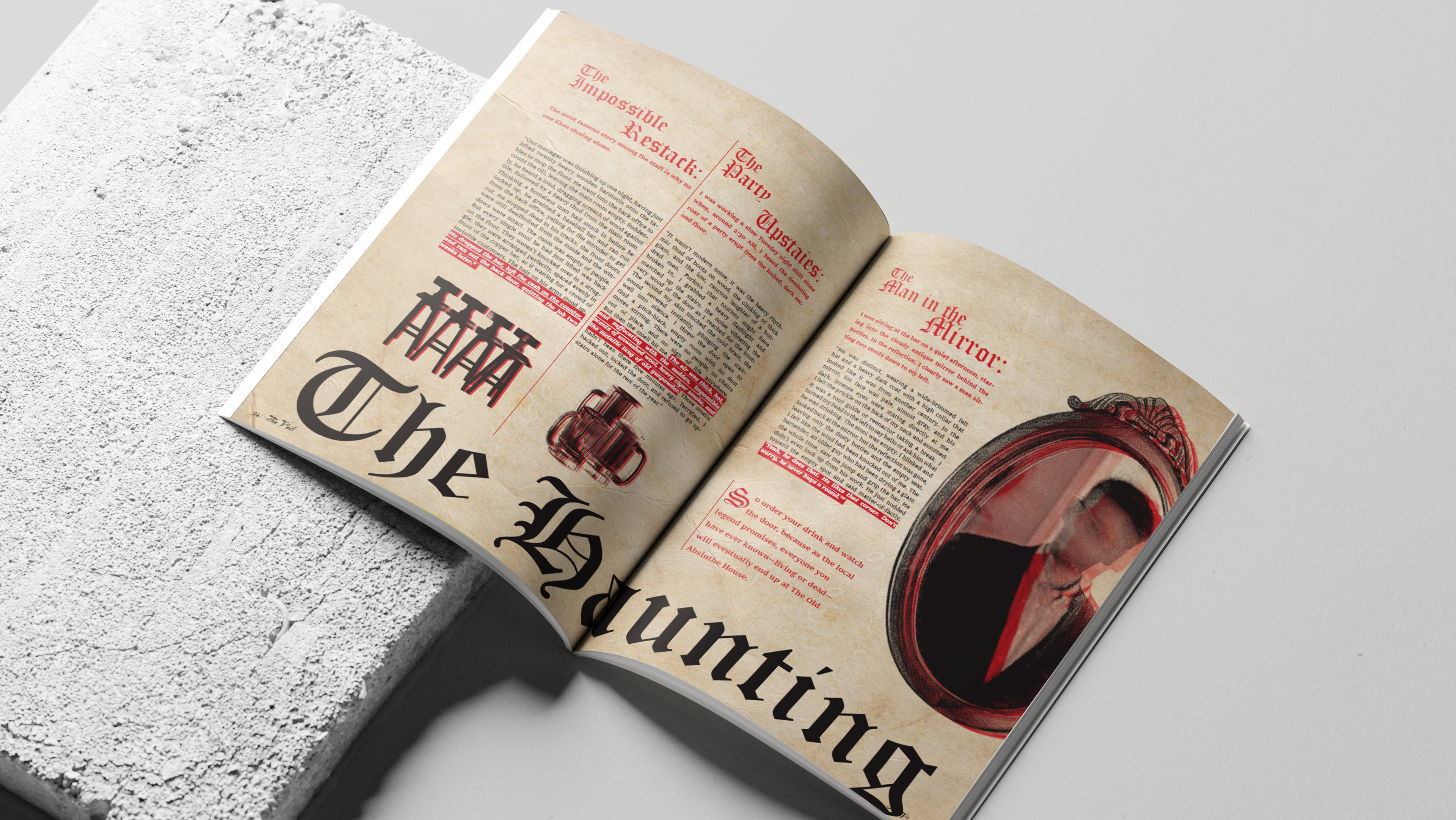
The central challenge was to architect a physical, immersive pop-up experience that successfully translates The Veil Magazine's gothic and spooky narratives into a terrifying, interactive environment. This event had to serve as a high-fidelity, social media-shareable spectacle — functioning as a dedicated hub for the magazine's community of ghost story enthusiasts. Beyond mere aesthetics, the challenge lay in creating a distinctive and chilling experience that reinforces the brand's identity while driving deep engagement within a specific urban landscape like Seattle.
Solution
The solution is 'The Spirit Lounge' — a highly immersive, temporary black-and-white gothic pop-up experience designed to physically manifest The Veil Magazine's spooky aesthetic. This exclusive event features an interactive area where attendees can sit with costumed actors portraying ghosts to hear their terrifying personal stories. The experience is further enhanced by a themed mobile drink truck serving unique non-alcoholic beverages, each named after and accompanied by a different ghost story. A custom coffin-shaped magazine rack displays the newest volume, and guests receive a mini tote bag containing the latest issue. The entire installation is built to be visually stunning — optimizing every element for social media sharing and reinforcing the brand's unique identity within the Seattle community.
About The Magazine
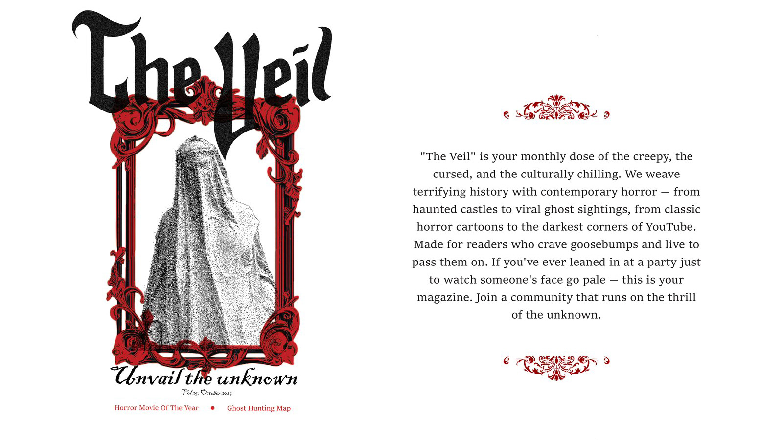
"The Veil" is your monthly dose of the creepy, the cursed, and the culturally chilling. We weave terrifying history with contemporary horror — from haunted castles to viral ghost sightings, from classic horror cartoons to the darkest corners of YouTube.
Made for readers who crave goosebumps and live to pass them on. If you've ever leaned in at a party just to watch someone's face go pale — this is your magazine. Join a community that runs on the thrill of the unknown.
Vol 25, October 2025
Horror Movie Of The Year · Ghost Hunting Map
Project Details
Pop-up Layout
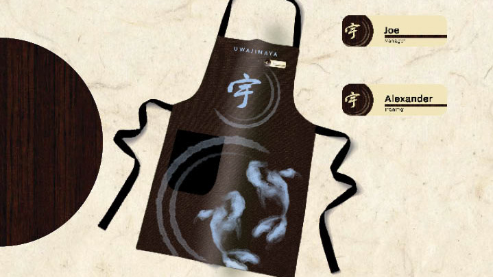
Uniform
Drinks Menu
Seating Area
Brand Identity · 2026
Problem
Uwajimaya, Seattle's longest-running family-owned Japanese grocery and import store (founded 1928), underwent a recent rebrand — but the result fell flat. The new identity leaned too heavily into corporate minimalism, stripping away the warmth, cultural richness, and family heritage that define the brand's soul. The challenge was clear: how do you modernize a nearly 100-year-old brand without erasing what makes it irreplaceable?
Solution
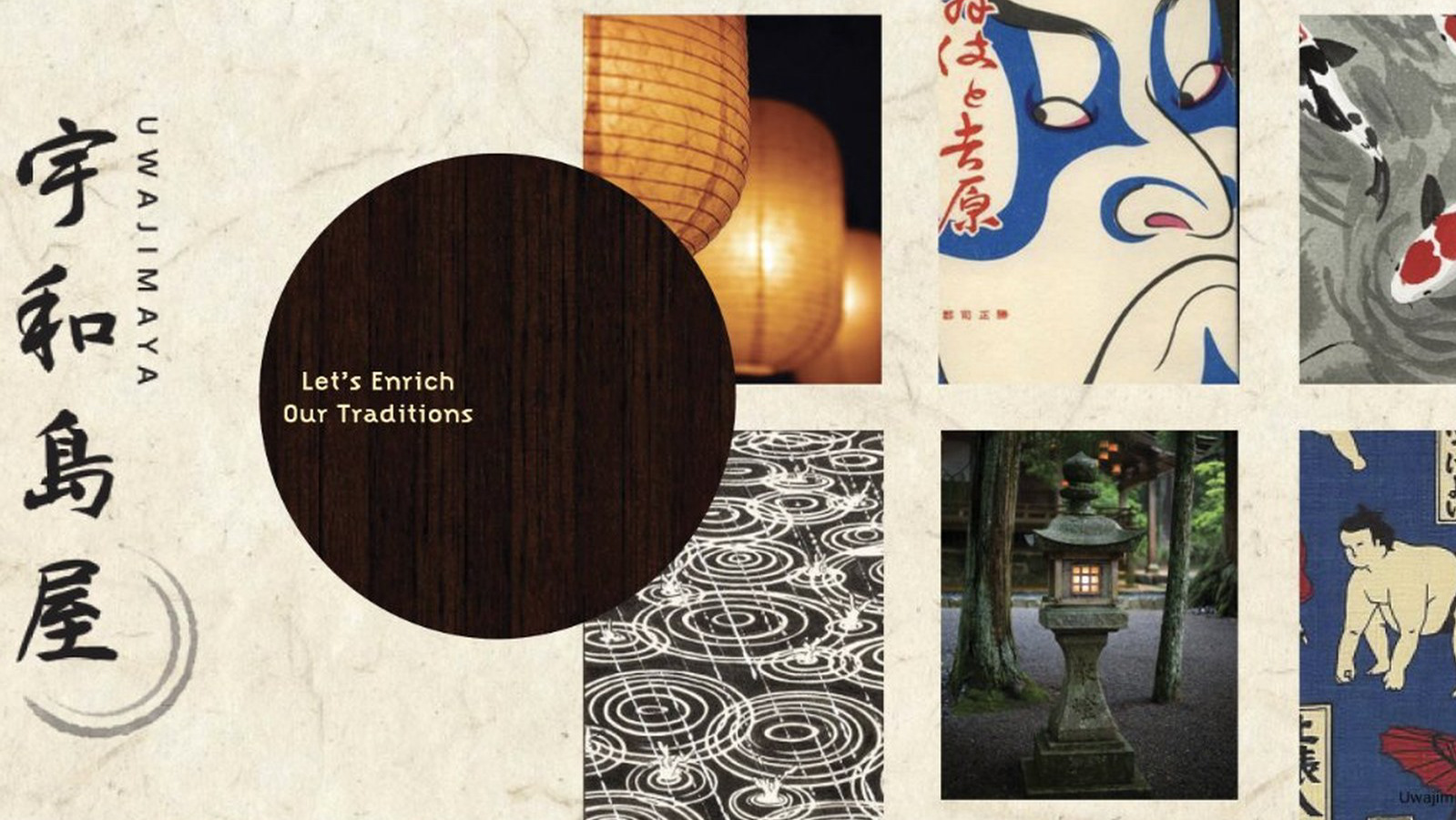
The team developed a rebrand rooted in three core tonal territories — Cozy, Asian-Oriented, and Harmonious — to create a visual language that feels both culturally grounded and refreshingly modern. Every design choice ladders up to those values: a six-color palette named after Japanese words, typography that pairs bold modern headers with brush-style subheadings, and hand-drawn illustrations that layer together into warm, approachable collages.
Mood Board
Illustrations
Vegetable
Meat
Seafood
Onigiri
Season